BANTER BY PIERCING PAGODA
Piercing Rebrand
From service to statement.
Repositioning piercing as self-expression—tested, validated, then scaled.
ROLE
Creative Director
SCOPE
Identity + Photography + Digital
CHANNELS
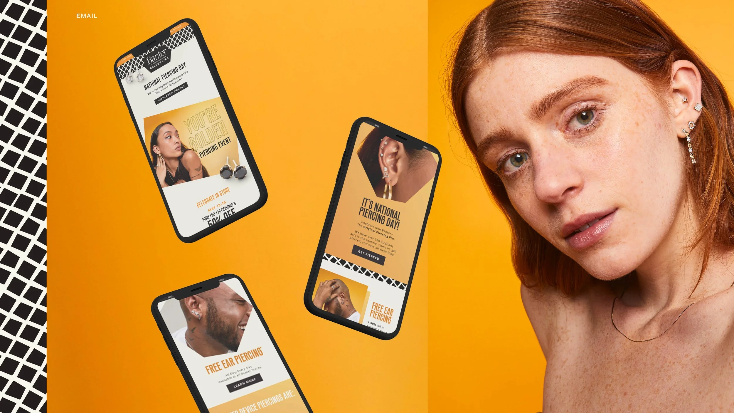
Digital, In-Store, Social, Email
COLLABORATORS
Agency - Red Antler
The Challenge
A high-value service that didn’t feel like one.
Banter’s piercing business was a true differentiator—free piercings, trained specialists, and a growing assortment of curated jewelry.
But the experience felt transactional, not cultural.
The brand wasn’t owning the decision.
Piercing was being presented as a service to complete—not a form of self-expression to choose.
The opportunity was to reposition piercing as identity-driven—something personal, confident, and worth celebrating.
An initial test validated the shift—driving an uptick in perception and sales before broader rollout.
My Role
Creative Direction, Agency Leadership, On-Set Direction
I led the creative direction of the rebrand, including the selection and management of the external agency partner. In close partnership with executive leadership, I shaped the vision from concept through execution.
I was embedded across every phase—from early strategy and casting direction through shoot planning—ensuring alignment to tone, audience, and brand ambition.
On set, I co-art directed alongside the agency team, guiding performance, composition, and styling to bring the new identity to life across all channels.
Strategic Approach
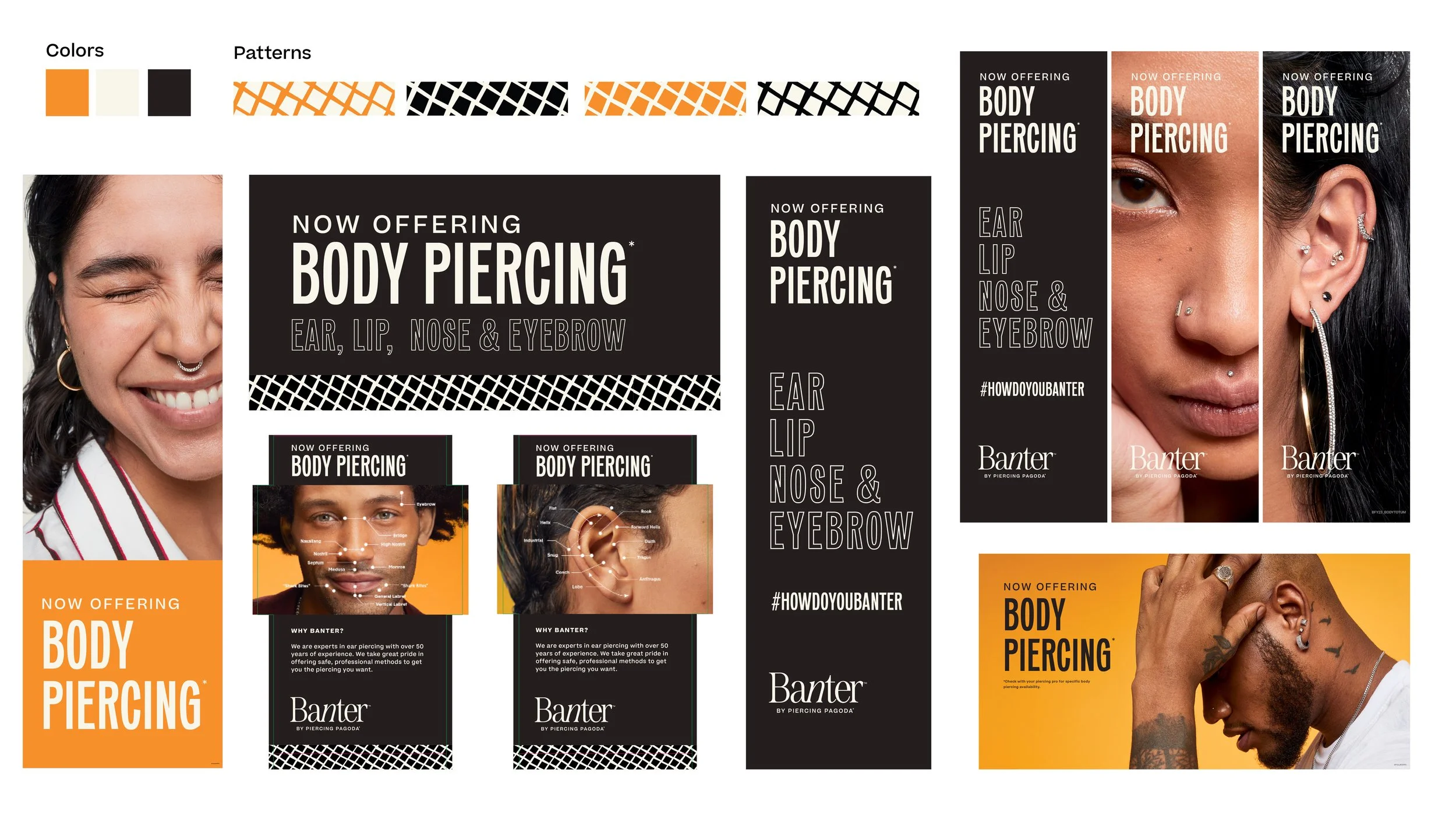
Reframing piercing as identity, not service..
The rebrand centered on a simple shift: piercing isn’t something people need—it’s something they choose.
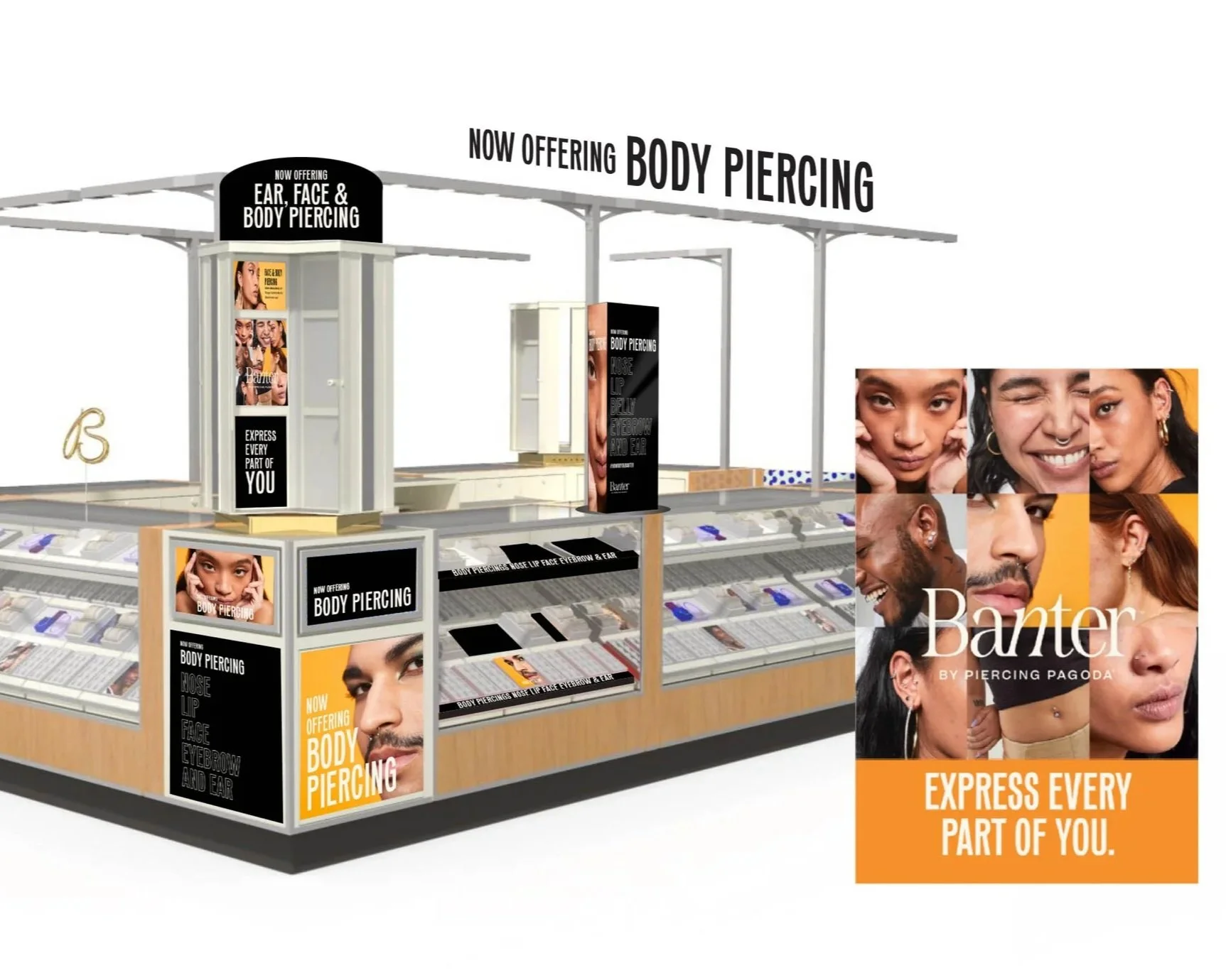
We built a system that reflected that mindset across every touchpoint:
Voice: A confident, declarative tone that reinforced autonomy and removed hesitation
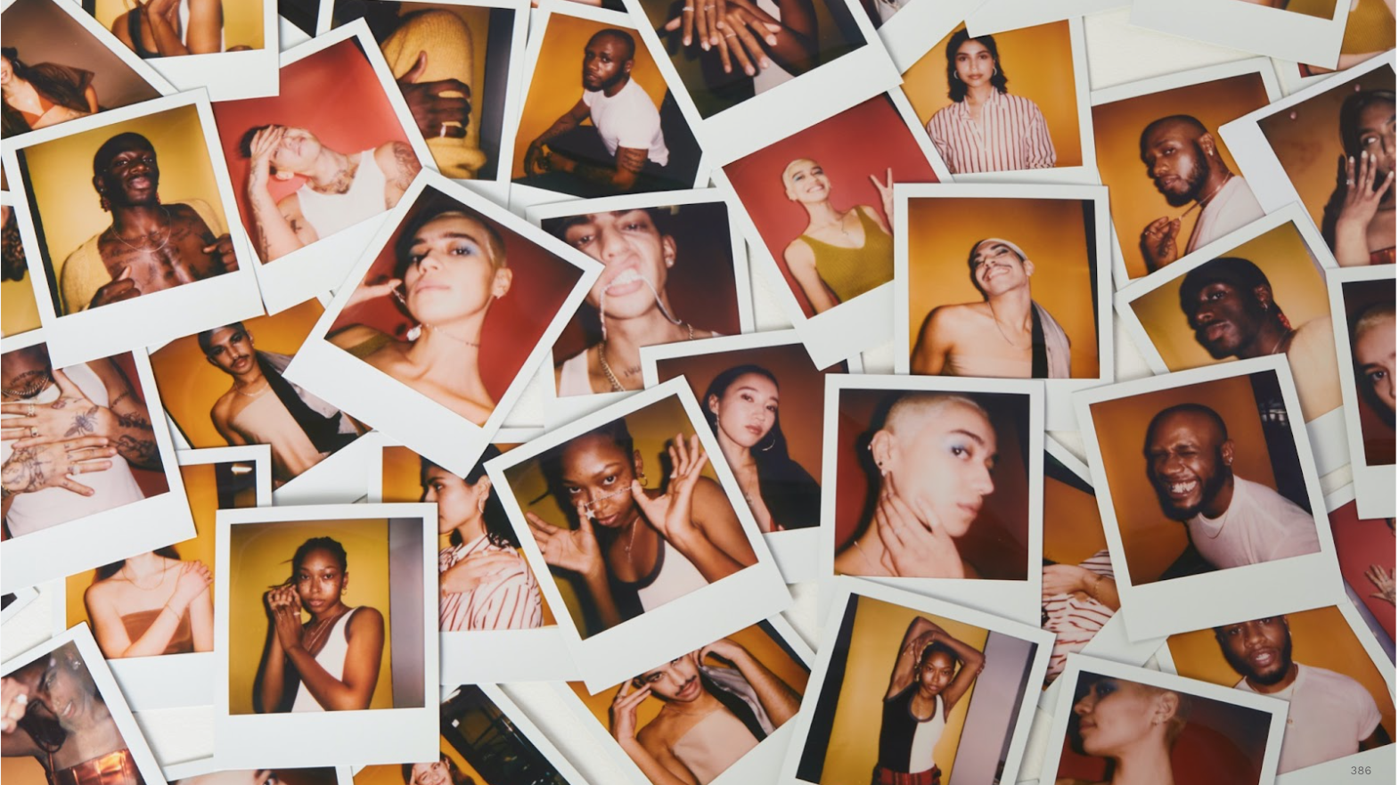
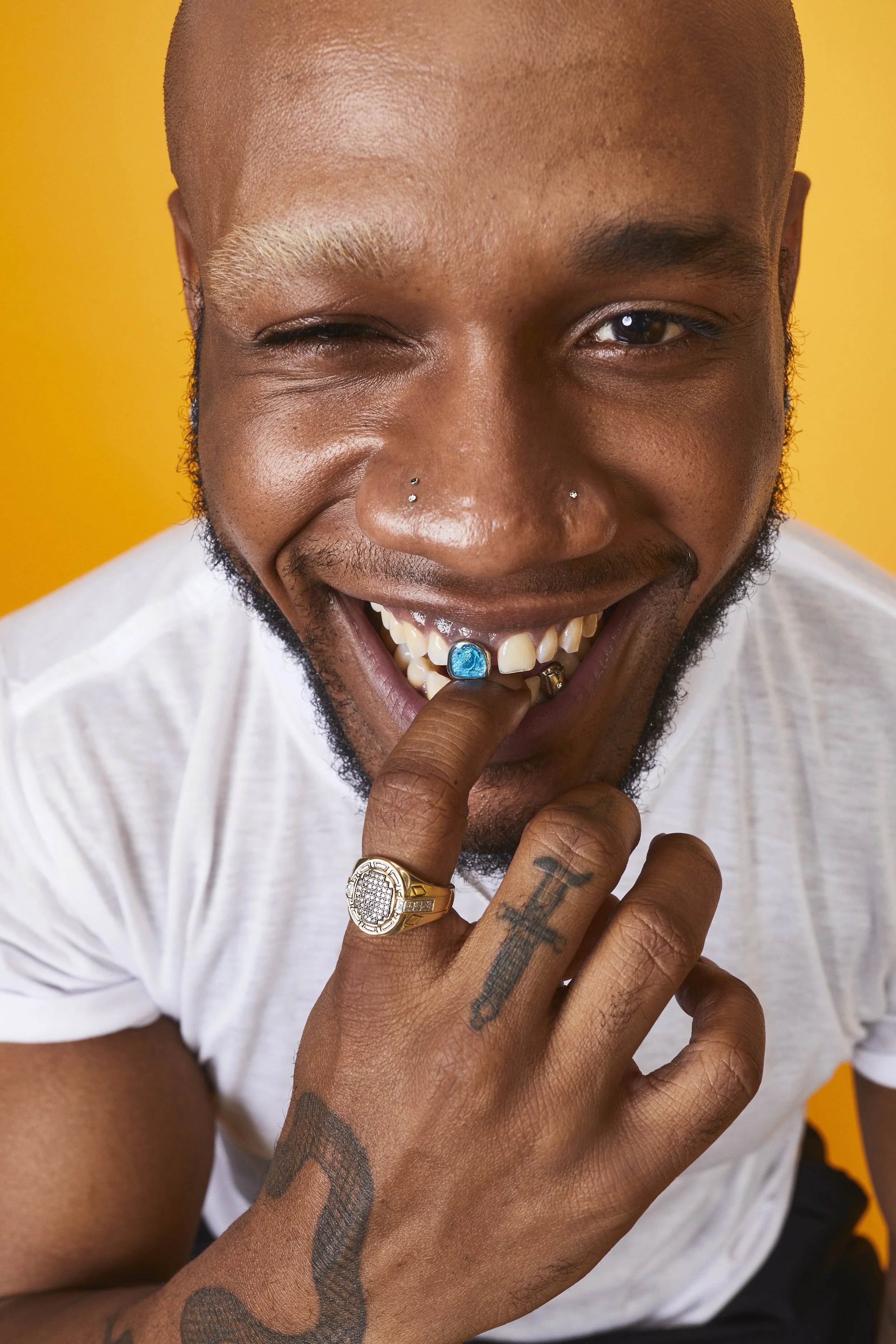
Casting: Diverse, expressive individuals styled to reflect real, personal choice—not perfection
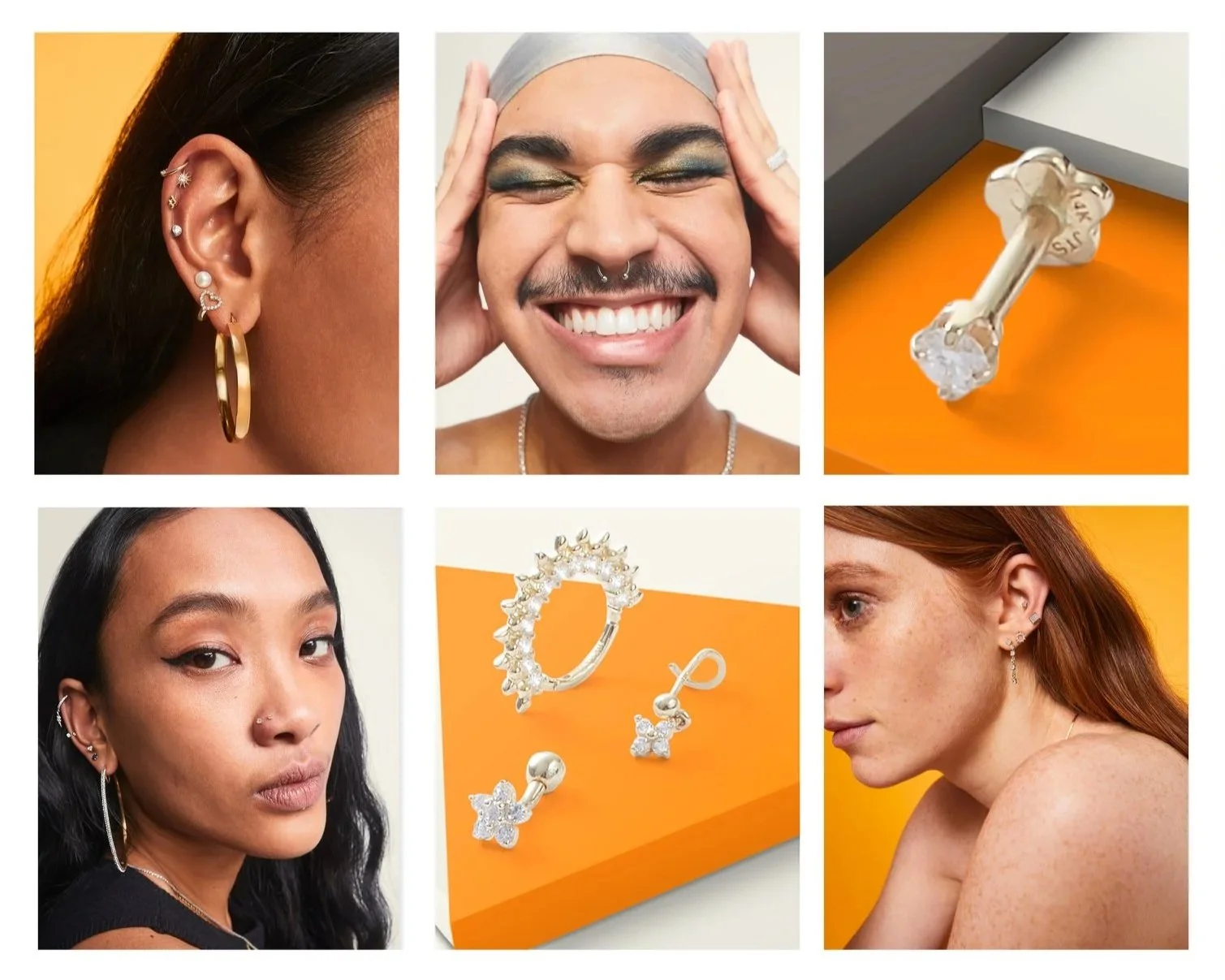
Photography: Tight, intentional framing that prioritized placement, jewelry, and individuality
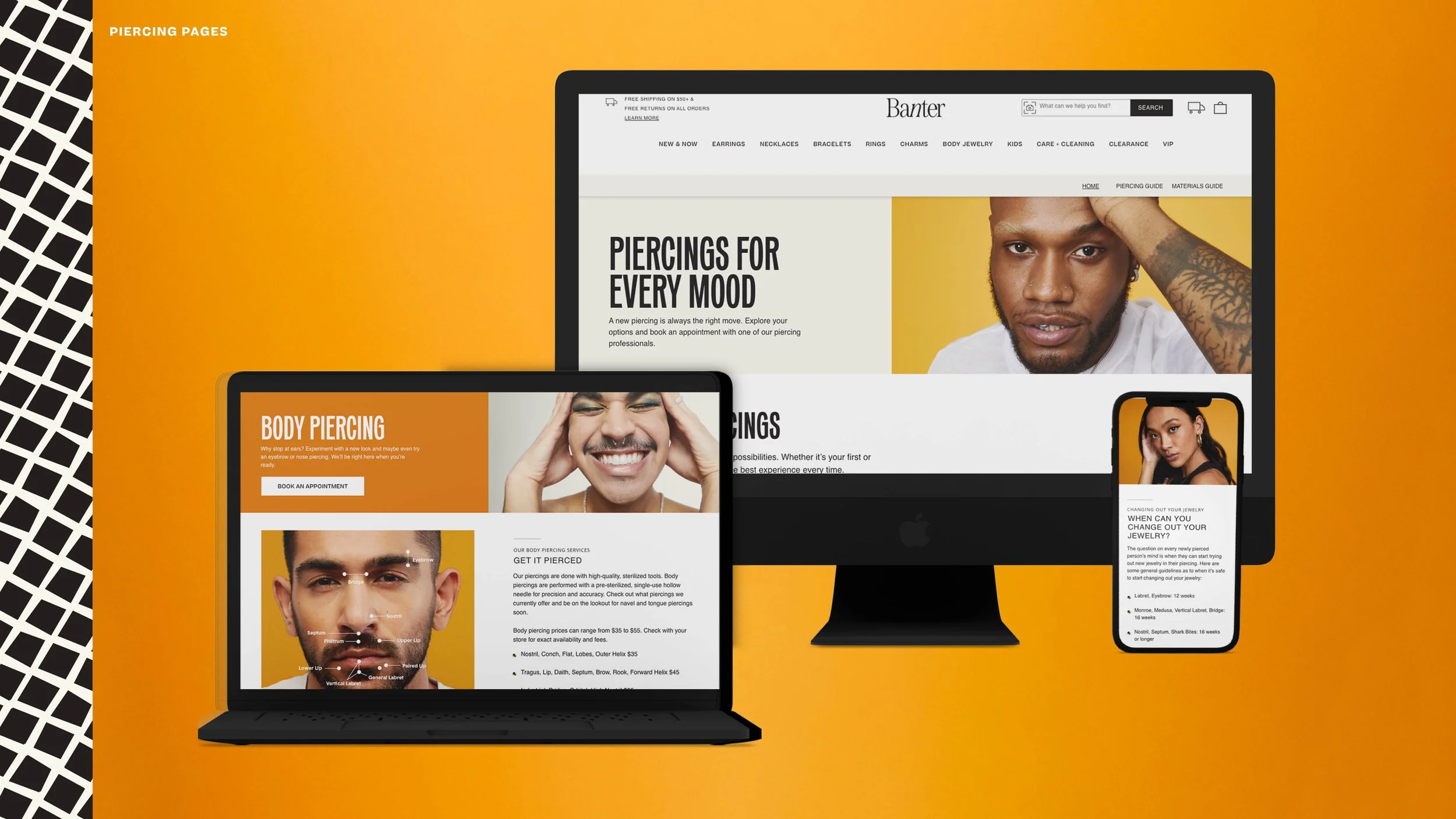
Digital Experience: Editorial-inspired layouts that made discovery feel curated, not clinical
The result was a cohesive identity that elevated perception—transforming piercing from a transactional service into a cultural expression.
Constraint as a creative tool.
Working within a constrained budget, I repurposed existing photography through color treatment and creative cropping — transforming dated assets into fresh campaign material without a full reshoot.
Tabletop product shots were designed for multi-use from the start: one setup, multiple crops, static and animated formats. Every shot worked harder.
CAMPAIGN VOICE
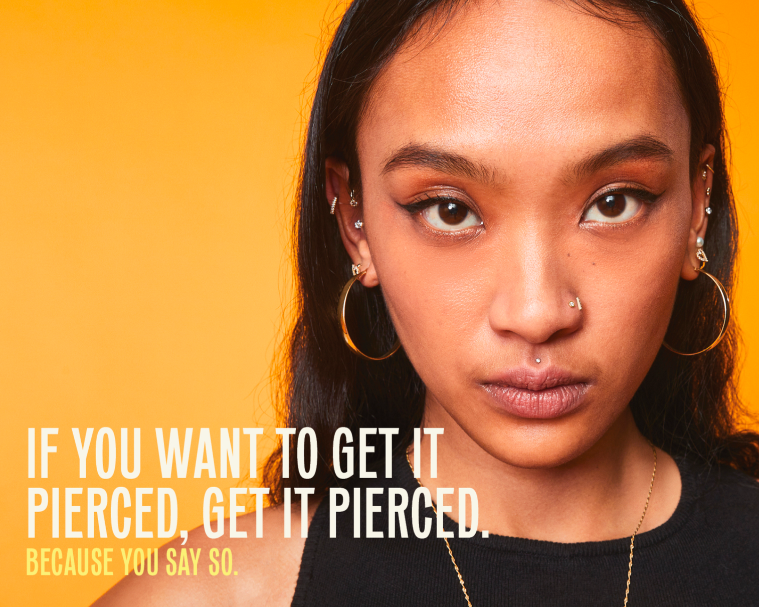
"If you want to get it pierced, get it pierced. Because you say so."
Effortlessly confident. Celebratory.
Colloquial — but intentional.