Peoples Brand Modernization
Helping Peoples evolve from a retailer without a distinct identity into a brand with its own voice, visual language, and point of view.
ROLE
Creative Director
SCOPE
Full Brand System
CHANNELS
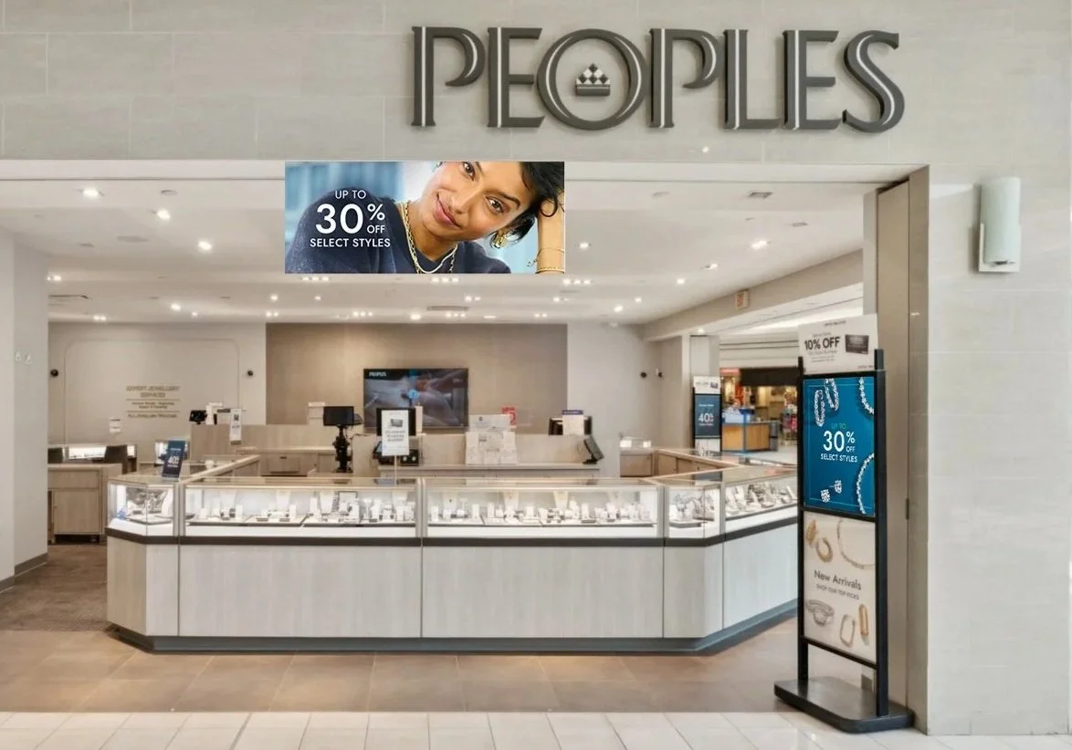
Digital, Social, Retail, Campaign
RESULTS
+17 Market Share Growth
The Challenge
Peoples lacked a distinct brand identity and relied heavily on repurposed creative from its U.S. sister brand, resulting in inconsistent messaging, outdated visuals, and poor alignment with the Canadian customer base.
The opportunity was to create a brand identity that felt modern, relevant, and distinctly Canadian.
My Role
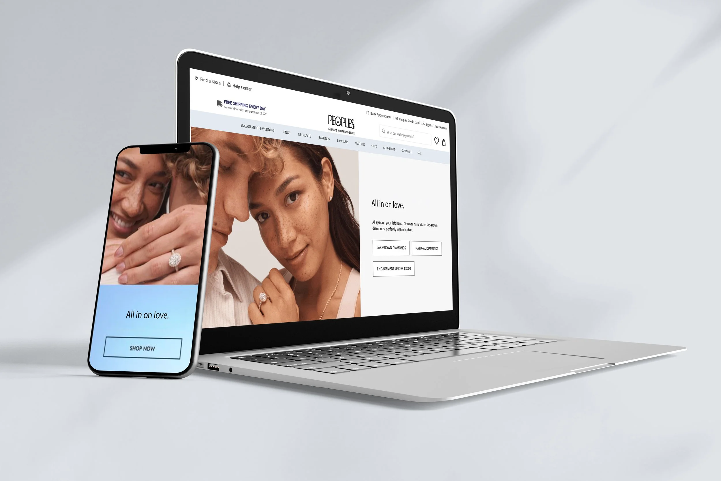
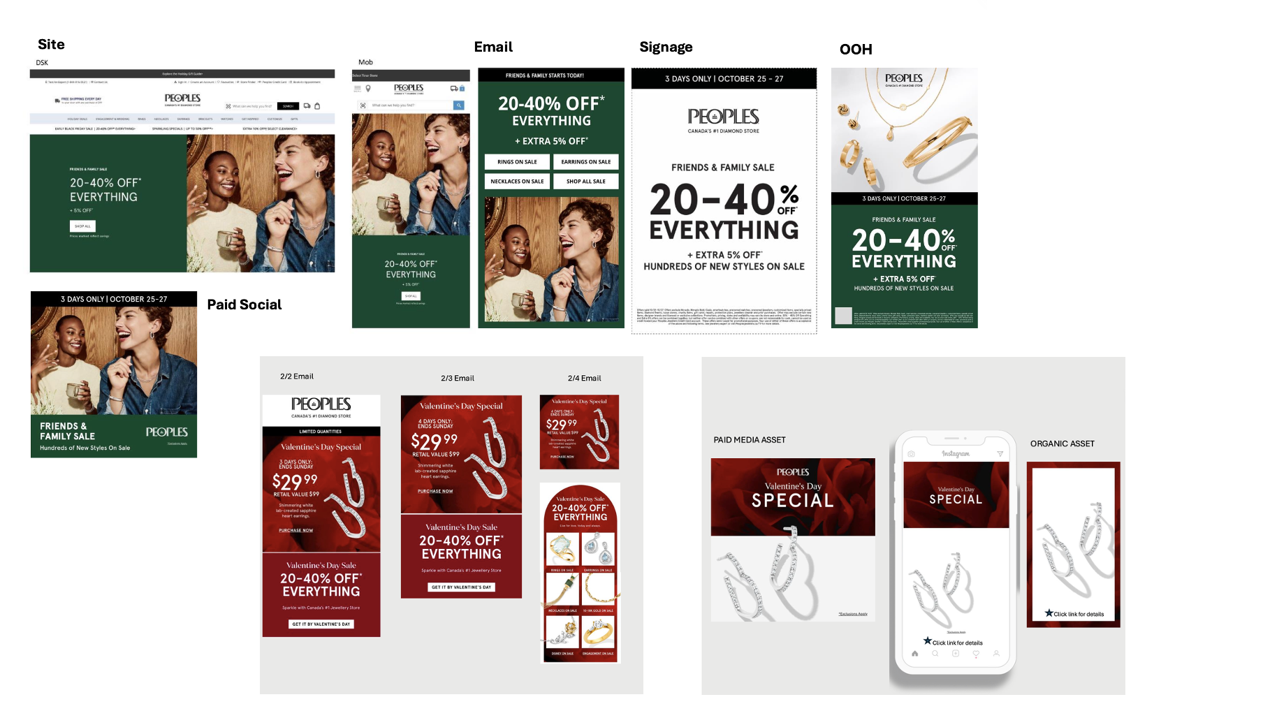
As Creative Director, I led the creation of the brand’s visual identity, bringing together internal teams and agency partners around a shared creative vision. From photography and casting to content strategy and production, my role was to establish a consistent point of view across every customer touchpoint.

BEFORE: The Legacy Brand
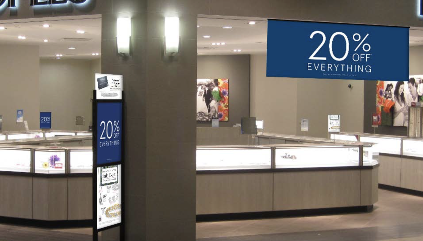
Discount Led

Jewelry as a prop, not hero
Discount Heavy

The New Direction
Strategic Approach
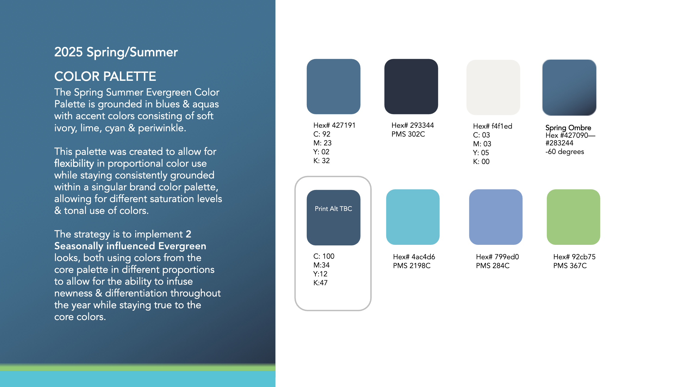
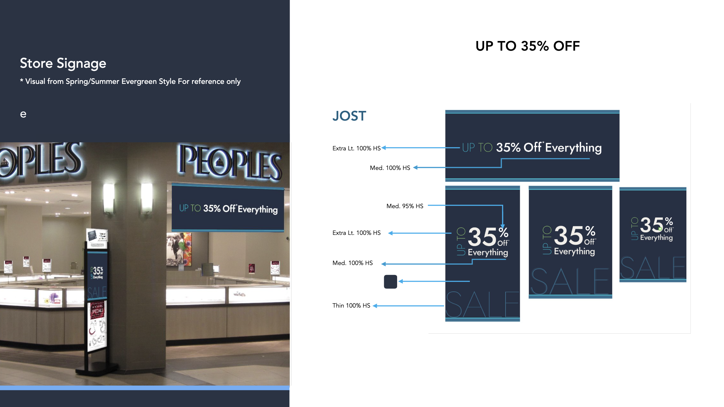
Defined a new color palette and visual identity
Introduced casting that better reflected the Canadian customer
Established photography standards unique to the Peoples brand
Moved from shared U.S. assets to dedicated Peoples campaigns
Integrated social-first content capture into every production
Created style guides that ensured consistency across future campaigns
+17 Points
Market Share Growth
Post-launch, Peoples gained market share in a mature category while peer brands decline.